So, I recently saw an image on Houzz of a very modern home that was predominately white. It was lovely. I was trying to imagine what it looked like prior to the paint job - thinking dark wood paneling and shag rugs. So, the white really brought it into the current century. But this made me think about several conversations I've had with clients on doing an all white space. Here in Birmingham there is a trend (it's actually been around for quite a few years) of everything in the space being super neutral - tone on tone. It is a lovely look, but believe it or not, it can be very difficult to pull off.
I've had a couple of consults where the client has tried to accomplish this look on their own. At first glance, you would think this would be easy to do, right?! Just pick only things that are white or neutral and call it done! Well, that strategy doesn't exactly work. And then they call me to "undo" what they've attempted.
I've had a couple of consults where the client has tried to accomplish this look on their own. At first glance, you would think this would be easy to do, right?! Just pick only things that are white or neutral and call it done! Well, that strategy doesn't exactly work. And then they call me to "undo" what they've attempted.
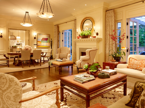
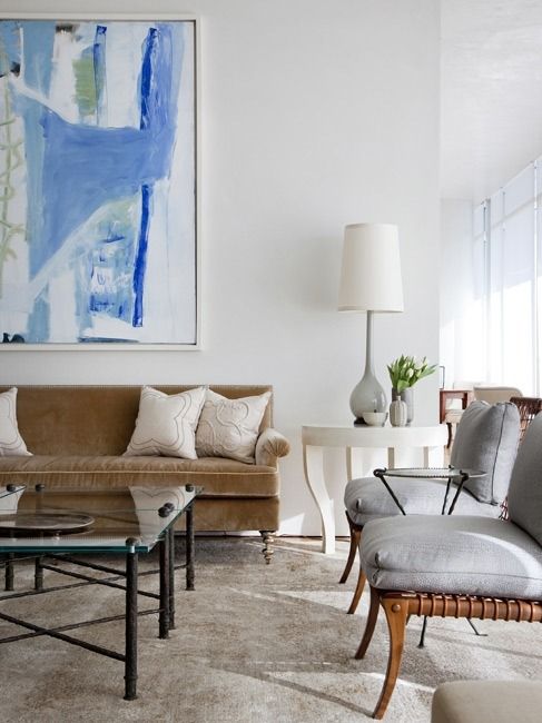
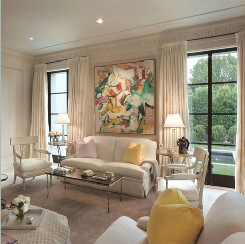
A tone on tone room can be stunning, but it takes a great deal of thought. Contrast in color is a tried and true trick for making a room feel interesting and high end. When you take away the element of color, you must focus on getting the necessary contrast and interest in other ways for the room to feel right.
Here are a few thoughts to bring in that contrast/interest when working on a tonal aesthetic.
1. Architectural Interest
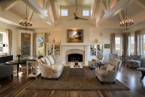
If your room has interesting architectural details (like vaulted ceilings, custom cabinetry, and interesting beam work) this can really help to pull off a tonal space.
If your room has interesting architectural details (like vaulted ceilings, custom cabinetry, and interesting beam work) this can really help to pull off a tonal space.
2. The Test - What does It Add?
I say this often in any space I design - each addition I make to the space should add something. It does not have to scream at you (this is an entirely different post!), but it needs to add something to the overall space nonetheless. In a tone on tone room, this becomes even more important.
3. Fabrics Are Your Friend
You have to use fabrics to get the contrast! Think tonal pattern and texture - from cut velvets to leather. It's all about mixing up these elements for interest. If you do all linen - everything from the upholstered pieces to the draperies, you will have a one note room that will not Wow.
You have to use fabrics to get the contrast! Think tonal pattern and texture - from cut velvets to leather. It's all about mixing up these elements for interest. If you do all linen - everything from the upholstered pieces to the draperies, you will have a one note room that will not Wow.
4. Lighting is the Jewelry of the Room
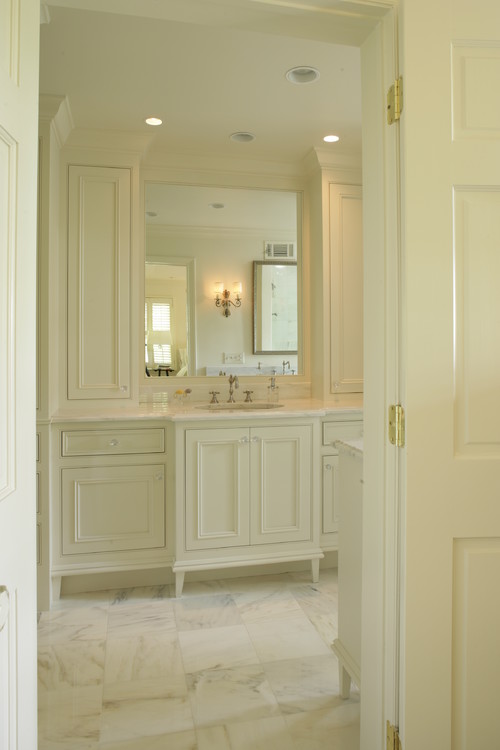
Think about what you want to highlight in the room and allow your lighting to help you accomplish this goal. With interesting architectural elements properly lit, they really become artwork for the space in a tonal way. By the way, I just love this clever bathroom layout with the tub tucked into the shower space. Great way to have both in a small space!
Think about what you want to highlight in the room and allow your lighting to help you accomplish this goal. With interesting architectural elements properly lit, they really become artwork for the space in a tonal way. By the way, I just love this clever bathroom layout with the tub tucked into the shower space. Great way to have both in a small space!
5. Focal Points Become Crucial
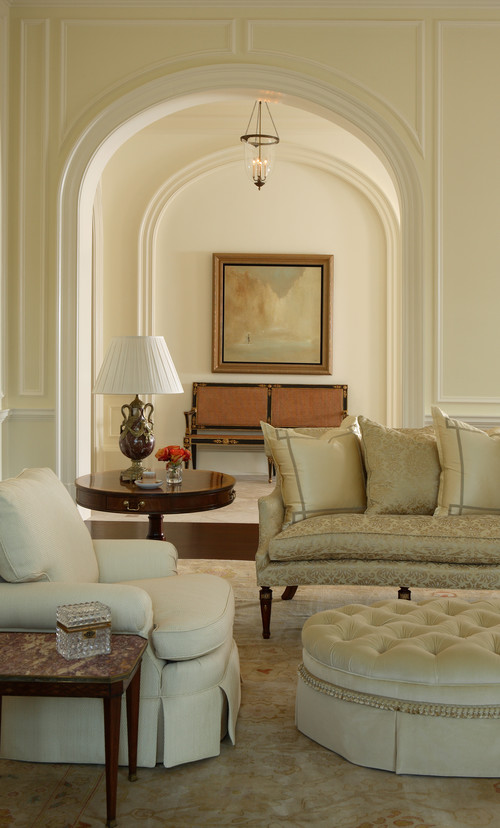
I do lots of redesigns where we use things the client already has to make a space feel cozy and finished. Lots of times, clients will say, I don't love that artwork, but when incorporated into the space, it looks great. If you are working in a tone on tone space, you must be very careful and selective of what you choose to hang on your walls.
The neutral palette will draw your eye to artwork like driving through a tunnel and seeing the opening at the end (how's that for a fancy analogy).





No comments:
Post a Comment