Happy Friday! Do you ever get a song in your head that you can't seem to shake? A couple of weeks ago we were in Knoxville for a soccer tournament for my daughter. One of the parents would yell "pressure!" every time their daughter got the ball and inevitably my brain would start playing "Under Pressure" by Queen. Weird, I know. I had to come home and download it on iTunes - still a great song.
Sorry to digress - none of the above has anything to do with today's post! Today, I wanted to show you a few pictures of a redesign I did last week. While I love creating design plans, my favorite project is still a redesign. This is using what a client already has in their home to create a completely new and fresh space! I love their reaction when they see things they've purchased and love in a whole new way. Also, the final result is always an unusual mix of found objects you just can't accomplish with all new items. So, here's what we did. Caveat: Some of the pictures are blurry as I took them with my phone, so please excuse the quality. As usual, I was so excited to get started that I forgot to bring the camera. So, when we arrived that morning, this is what we had to work with - a clean slate (it saves time if the client pulls everything down, so we can get to work). This is the wall you see when entering the home.
It was just begging to become a gallery wall! Also, I did not take any wide shots of the room, so I thought I would show you the layout of this cozy cottage. Originally, the sofa was on the window wall and the gallery wall had a small chest flanked with a pair of armless chairs. One large piece of artwork hung on the large wall. When I saw the space for the first time and all the incredible artwork this client had collect over the years (which was all stored), I knew we needed a new layout so we could display all that incredible artwork. Here's the before:
After several tries on the new layout (we are not dealing with a lot of space, people, so furniture placement was very challenging!), we came up with this new layout which gave us that big fabulous wall for artwork.
When creating a gallery wall, it's important to lay the artwork out on the floor to really get the best result. This will allow you to play with the shape of the frames, the color of the artwork and how the two play off of each other in the finished gallery wall. Also, it will allow you to see the finished size of the grouping to make sure it will fit on your wall! Here are a couple of shots of our layout (it was so large, I had to take it in sections).
By taking a picture of the placement when it's on the floor, it actually helps you to remember exactly where each piece is in relation to the others (this is sometimes difficult to remember once you begin to hanging the pieces on the wall).
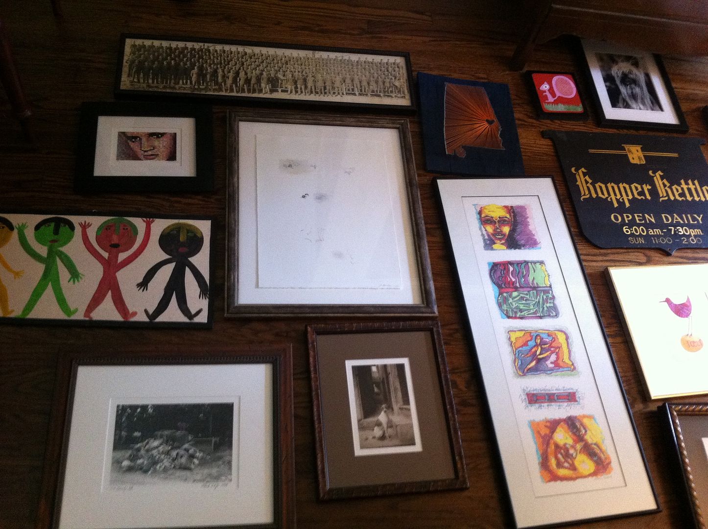
So, here is a picture of the final wall. You can see, we adjusted the wall a bit from the floor layout, but I just love the result - wishing I had such fabulous artwork for my own space!
And here are a couple of other spots in the room we freshened up with artwork and styling.
As an aside, the TV will be hung over the fireplace. I've had lots of conversations with clients lately about whether it's "proper" to put the TV over the fireplace. While I love a room with the TV completely hidden, sometimes the best layout for the room will dictate TV placement over the fireplace. This is a very small living room. The only other wall (other than over the fireplace) where the TV could go would be our fabulous gallery wall. So, we opted to put it over the fireplace. The writing desk was in a guest bedroom and the shield mirror was in a closet. Initially we had the military picture included on the gallery wall, but decided this side of the room needed more height (you will understand when you see the wall to the right of the fireplace). Stacking artwork is a great trick to give you some symmetry for walls on either side of a focal point like a fireplace.
Sorry this picture is so blurry (below). This is the wall to the right of the fireplace where the armoire was initially placed. Wish this picture were clearer as the series of artwork is from a favorite artist, Kate Merritt Davis. I have one of her pieces in my own kitchen!
Then we moved the large piece of artwork that was on our now gallery wall to a small wall separating the living space from the dining area. This created an entry way feel. We toyed with the idea of painting the side of the bookshelves the wall color just to give us a larger wall for this chest, but in the end, all the trim work/detail in this spot would have looked a bit off (hard to decide where to stop the wall color without it feeling strange). So, instead, we placed a basket in that spot to be used to store shoes, or umbrellas, etc. It also added lots of texture in a layered way. (see our note to the client of what she could use this for!)
One last picture, we also restyled the bookshelves for a fresh look next to the gallery wall.
There are a few new furniture pieces coming into the space. Once they arrive, I'll have to get additional pictures to show you. Happy Weekend. M.


No comments:
Post a Comment