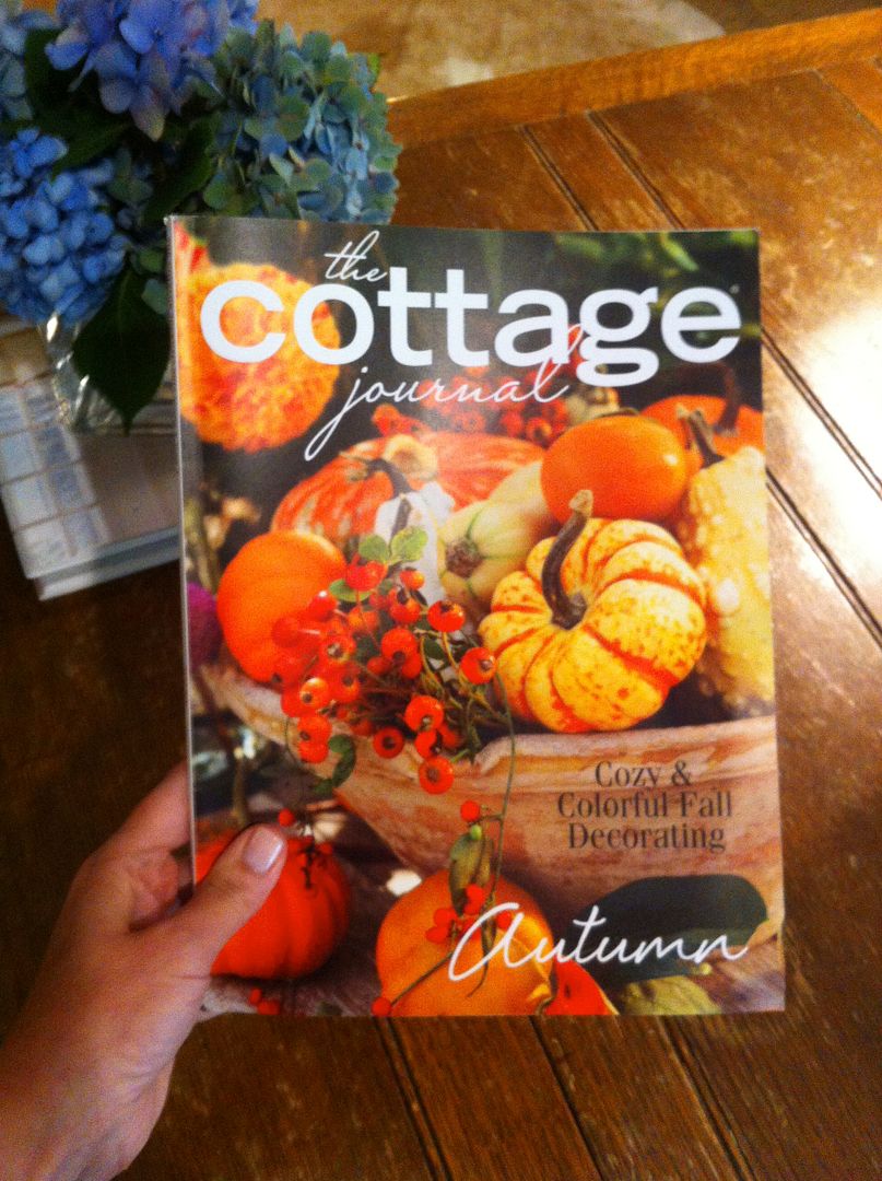
As I recently mentioned, one of my projects has been featured in The Cottage Journal for their Fall issue! Here's my original post on the announcement. I'm just over the moon about it!
The issue is now available on newsstands, and I've already gotten a couple of questions about some of the furnishings from readers - like the semi-custom barstools (which I will discuss later)! If you are not familiar with this wonderful magazine, here's your chance. Their website offers you a sneak peek of what they provide in every single issue (let me just say, they are bringin' it). Click here for a sneak peek.
Since the article on my project really focuses on the kitchen/breakfast area of the space, you will have to grab a copy of the magazine to see the details there. But, I thought it would be fun to give you some details on the family room space which was also part of the overall project.
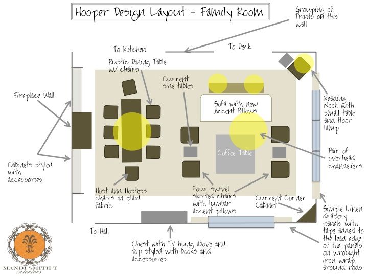
Here's the original design layout . . .
FYI, my design layout software has changed a great deal since I did this plan. But, it will at least give you the general idea on the space.
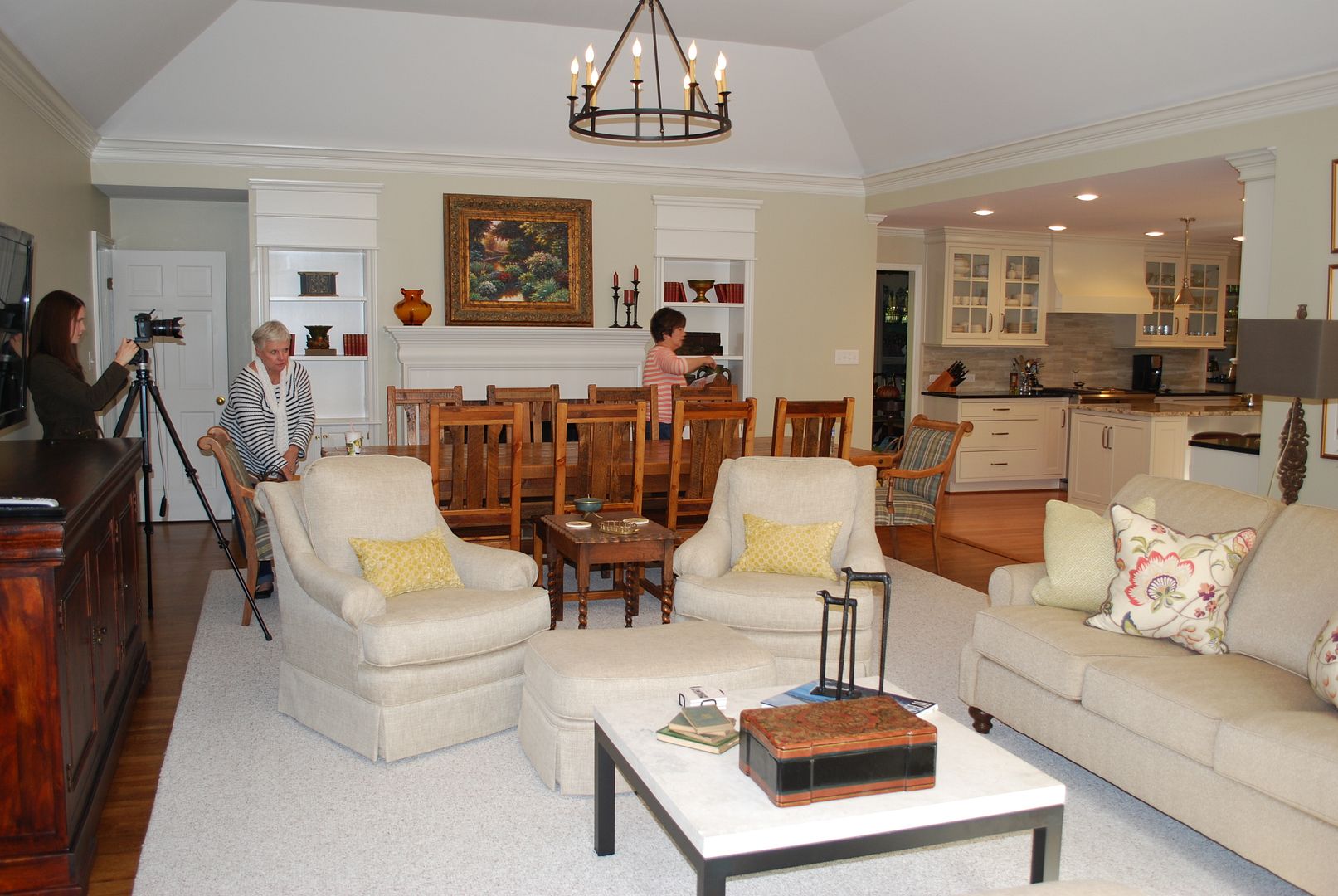
And here are a few pictures of the space taken during the photo shoot. When my client called me to help her she had already ordered the rustic custom table for the space and wanted to reuse the artwork seen over the mantel. So, I got busy selecting the other pieces for the space to blend the two styles.
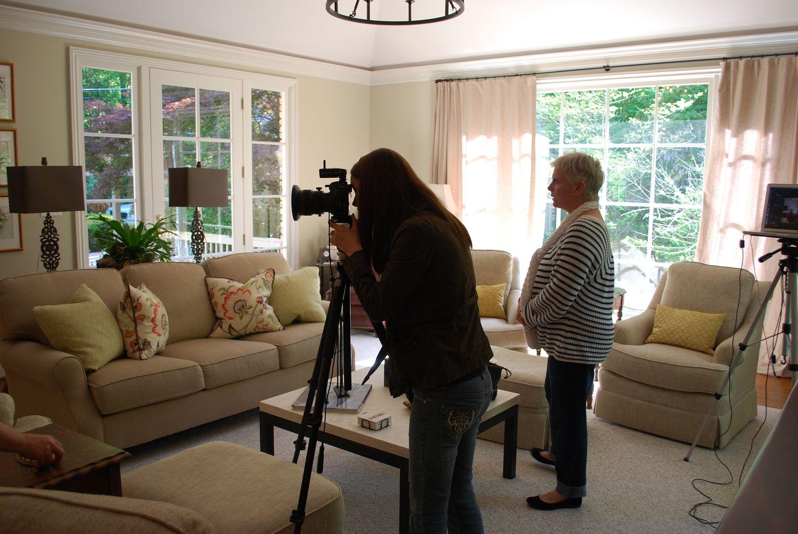
Here's a shot of the space from another angle. As you can see it is a large, light filled space with a tray ceiling. On a side note, we added a pair of these rustic chandeliers to the space. I just love them. They are a knock off of a very expensive chandelier. These were a fraction of the originals, and I found them here - Old World Chandy (they are heavy and look amazing in person). Also, remember, if you are thinking of adding a chandy, you need to be sure it will fit - Measuring for a Chandelier.
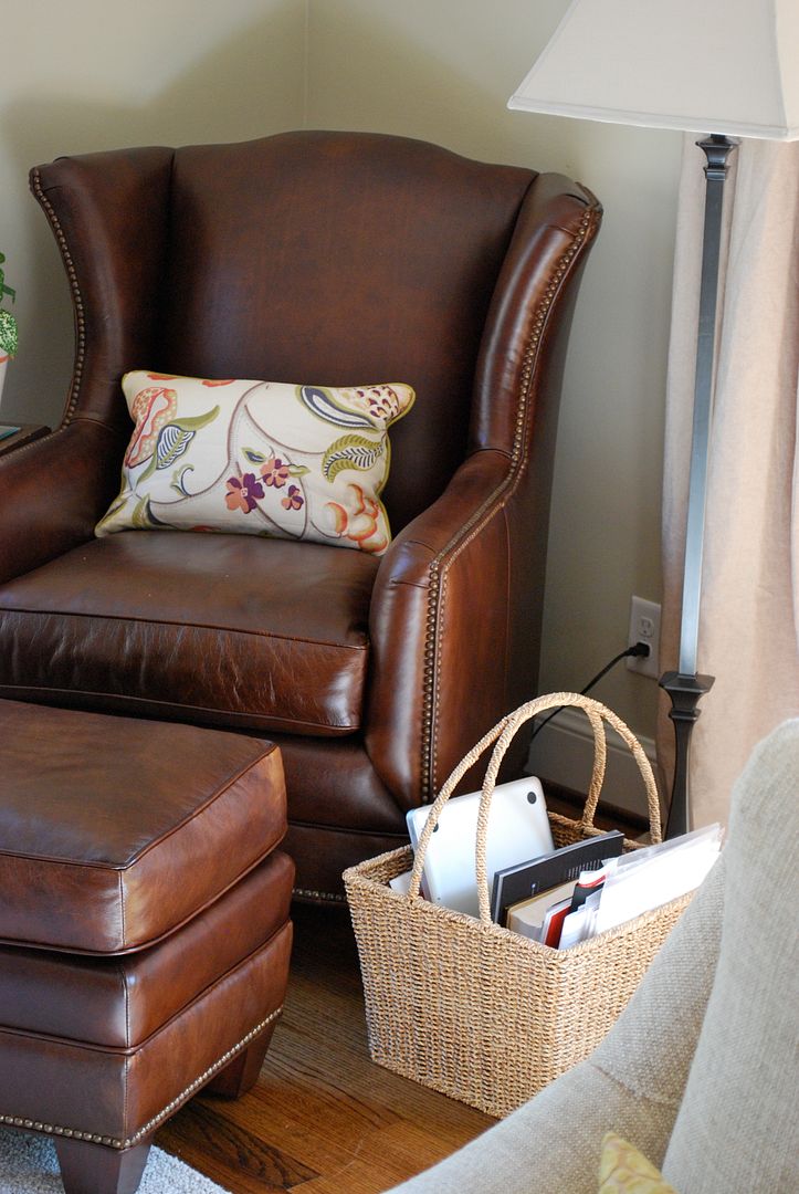
Here's the reading nook in the far corner of the space. A perfect place to sit and surf the net.
Here's a close up the accent fabric we used to add pop to the otherwise neutral space.
I hope you'll pick up a copy of the issue. It is simply overflowing with Fall inspiration. I promise it will definitely get you in the mood for the upcoming season! M.


No comments:
Post a Comment